Temple University Owl Logo Rebrand
In fall of 2021, Temple University’s Athletic Department enlisted designer Joe Bosack and Tyler School of Art and Architecture’s Design Workshop class to create an updated owl logo for the athletic teams. We conducted A/B testing, interviews, and presentations to create a mark that the university community would be proud of. The new owl athletic mark was released to the public in 2023 and can be view here.
Throughout the process, each student created their own owl marks based on the creative brief and client feedback. Our designs followed the same creative process as the mark we created for the school, reflecting the research we conducted and the feedback of the Temple Community.
Role
Designer
Institution
Temple University, Tyler School of Art
and Architecture
Photo Credit: Joseph V. Labolito
Art Direction
Bryan Satalino and Joe Bosack
Deliverables
Branding
The Creative Brief: Refresh the Temple Owl Mark
Our goal was to create a new, responsive logo for Temple’s Strategic Marketing & Communications department and Temple Athletics that will unify students, alumni, and staff. The current logo has too many lockups which lessens the brand’s value. The new logo would be a scalable, responsive head only and full body icon with a modern, simplistic design.
We established that the tone of the logo should reflect a feeling of boldness, tenacity, and pride. Along with this, the mark needed to look fierce, majestic, and progressive.
“Boldness, Tenacity, and Pride”
Identifying Problems
To start off this process, our class met with the Strategic Marketing & Communications department to discuss the creative brief along with our client’s goals and pain points. Analyzing competing logos like Penn State University’s and Saint Joseph University’s allowed us to identify problems in Temple’s current owl mark. We visited the school store to review how the logo acts on various merchandise and identify what to avoid and what to focus on when creating the new mark.
We concluded that the outdated 90’s design style of the owl logo inhibited its success in the current market. The logo acts more as an illustration because of how detailed it is. It uses five colors, harsh outlines, and has a very aggressive expression. The excessive details do not translate well on small collateral like hats at the school store. The employees there shared that it is not favored by the target audience when they make purchases either.
Design Process: Initial Ideas
We started the design process by sketching our initial logos while keeping the idea of boldness, tenacity, and pride in mind. The sketches referenced an actual owl's proportions with focus placed on features that would help identify them like their beak, claws, and ear tufts.
We brought our sketches into class for our first critiques and then vectorized them after receiving feedback. To push our ideas, we swapped logo concepts with one another and began editing each other’s work. We then brought elements back into our own ideas.
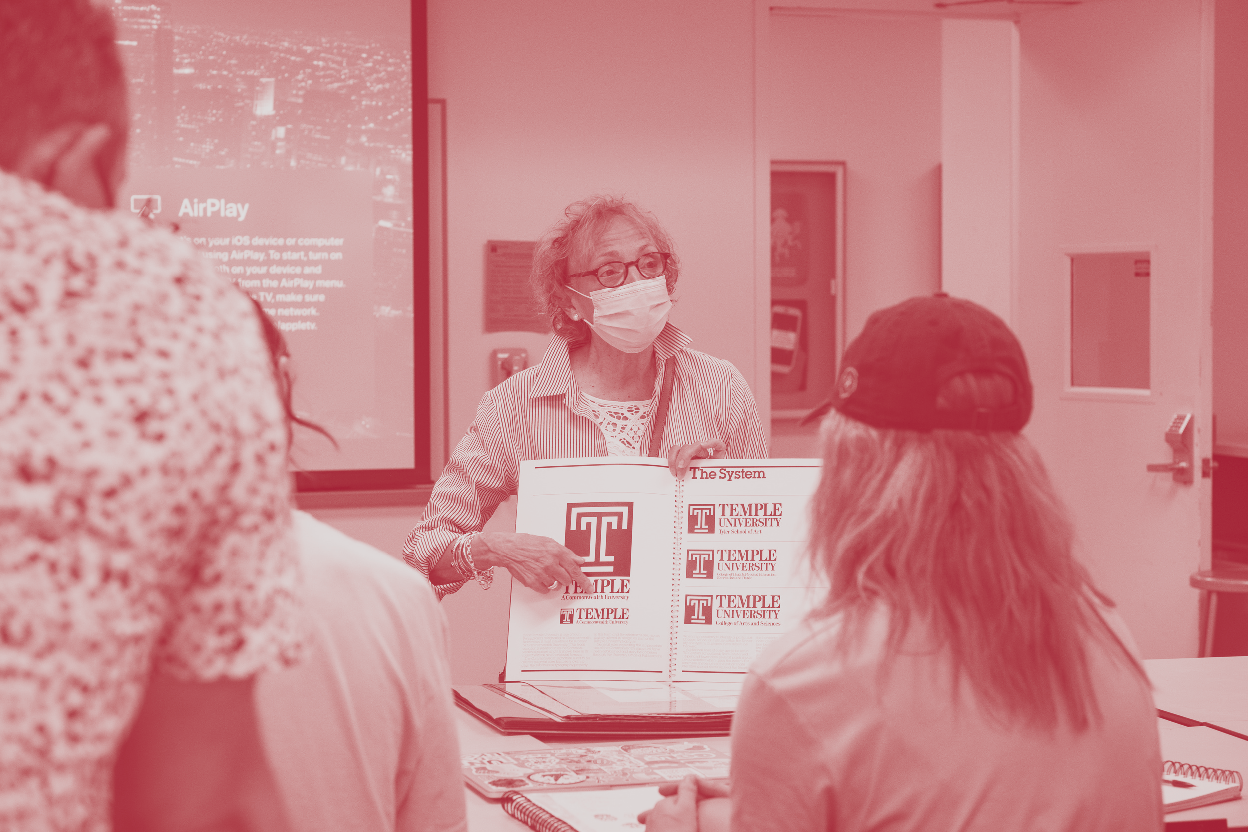
Class critique with Joe Bosack and Bryan Satalino. Photo Credit: Joseph V. Labolito
Meeting Stella the Owl
Our class got the opportunity to meet with our school owl, Stella. We observed the bird’s proportions, behaviors, and movements which helped inform our designs.

Learning About the Temple ‘T’
We had the privilege of meeting the designers and professors who created Temple’s iconic ‘T’ logo. They talked to us about their process creating the mark with students decades before and the path they took to reach the final mark. Through this, we recognized the importance of connecting the official logo to the Temple ‘T’.
Presentations and Focus Group Testing
Throughout the semester we presented each stage of the logo process to our clients. Our class recorded the client’s reaction to further the school’s logo as well as our own designs. We reviewed notes together to find common themes in the clients’ feedback.
In the focus group tests, we presented the logo concepts to current students, alumni, and staff and recorded the feedback from each group. The data pointed to the target audience’s wants and their pain points around the current logo. These sessions solidified the need to incorporate a diamond into the mark as well. The shape has a strong association with Temple because of Russell Conwell's ‘Acres of Diamonds’ speech given at the school years prior. It is ingrained in the university’s identity and the majority of the focus group tests felt it was important to include.
Final Design Process
Each week Joe would bring in the official logo his team were working on to get feedback from our class. We got into groups and made edits to each version that would be presented again until the last round of revisions. By the end of December, the final design was chosen for Temple.
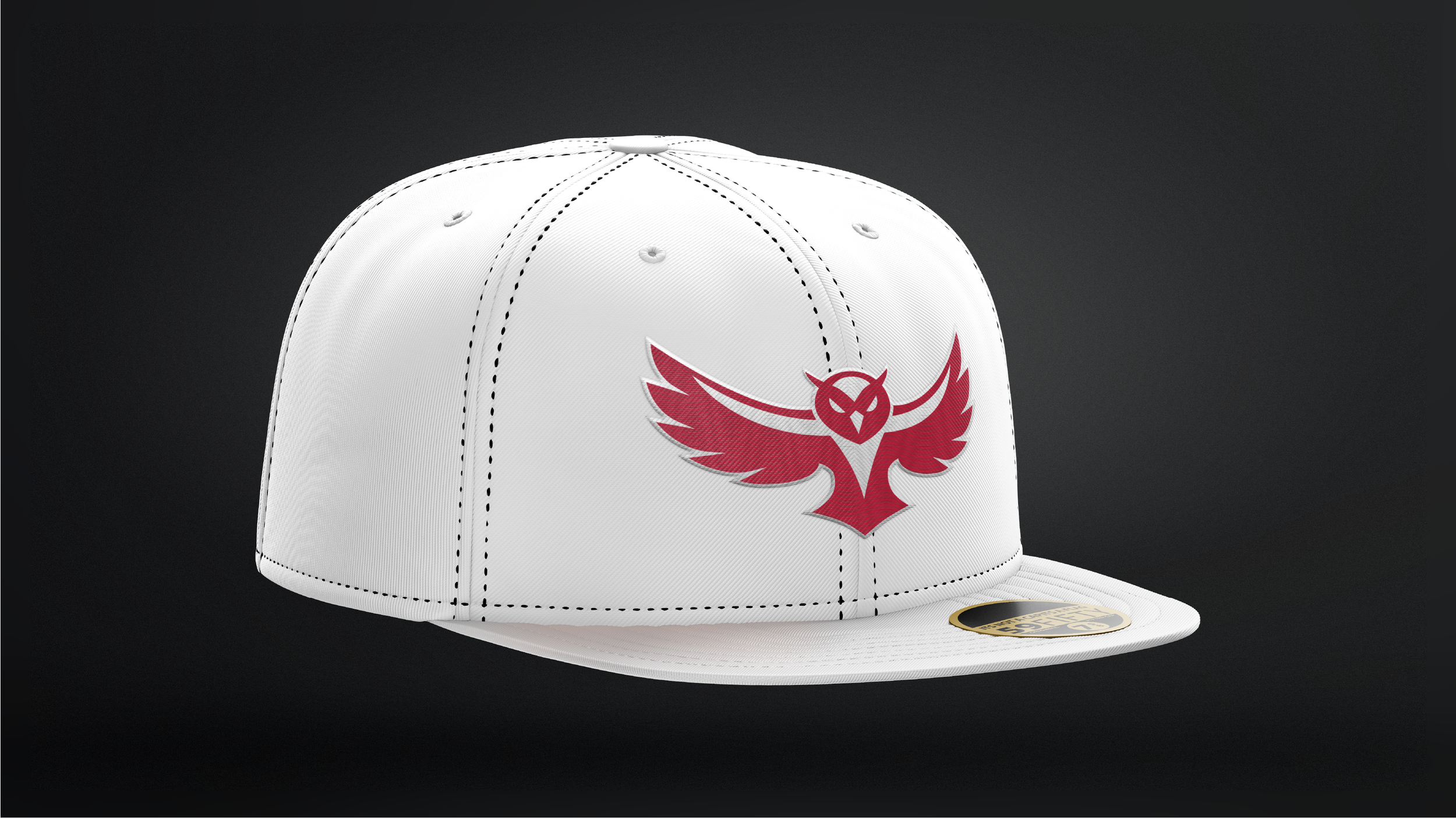
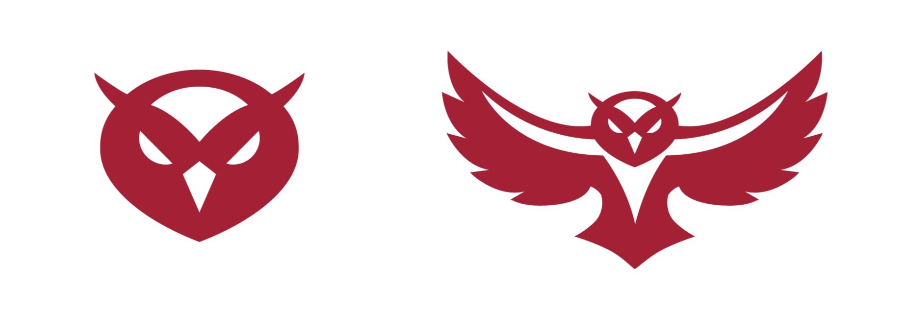
To incorporate the diamond shape, I started by making it the outline of the owl’s head. I then rounded the edges and simplified the mark while keeping it contained in the diamond shape. Alongside the head, I also designed a full body logo to maintain consistency between both. The logo utilized Temple’s cherry and white colors, and worked with both as either the background or the owl’s body. By the end of the semester I created an owl logo that adhered to the goals of the creative brief and connected to Temple’s Brand identity.
Final Logo Design
I reached my final design by incorporating the feedback from the presentations and focus groups while maintaining the goals of the creative brief. I went through a series of revisions to reach a final design that reflected feelings of boldness, tenacity, and pride.


Implementation of The Owl Mark: Collateral
I created a series of collateral to see the logo in realistic use. This consisted of merchandise that would be found in the school store for the target audience to buy. Along with this, I experimented with placing the logo around campus to incorporate it into the Temple Community.