Developed Component Library to Create Consistency Among 118 Member Organizations
Role
Designer
Project Type
Component Library
Agency
Bailey Brand Consulting
As our team took on a growing volume of web projects for our client GS1, we recognized the need for a more efficient and consistent design process. To address this, we proposed building a Figma component library to streamline web page creation for delivering resources to small businesses.
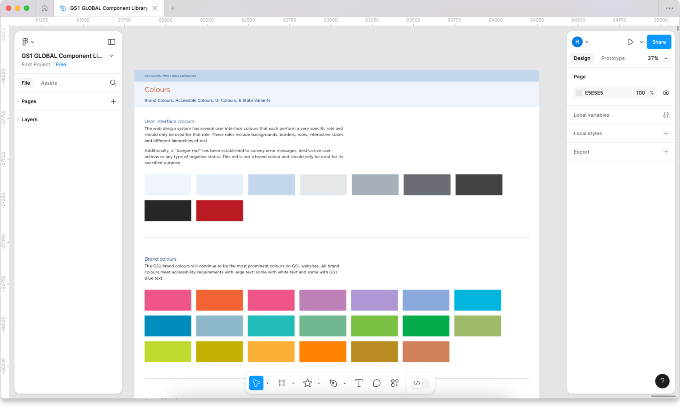
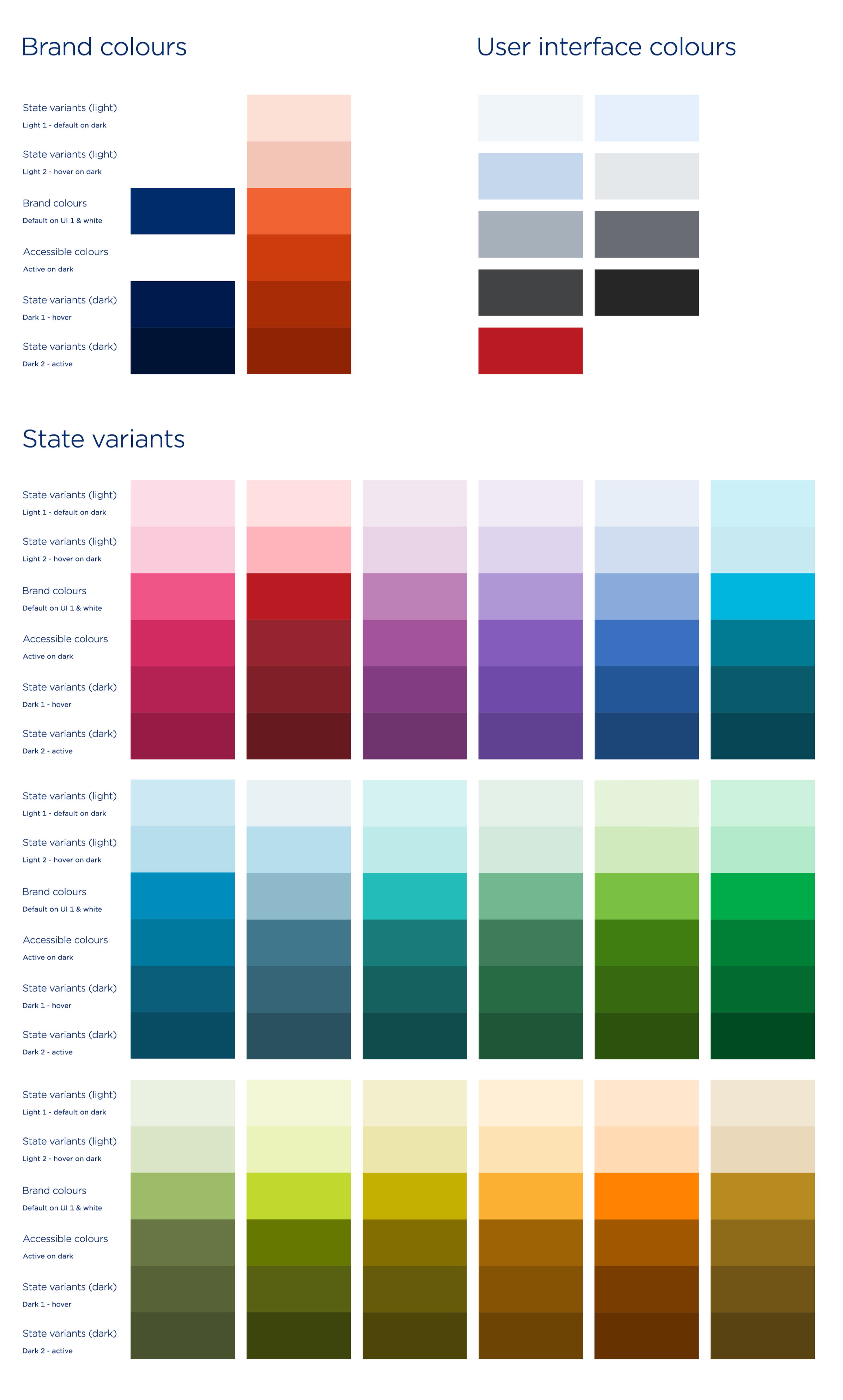
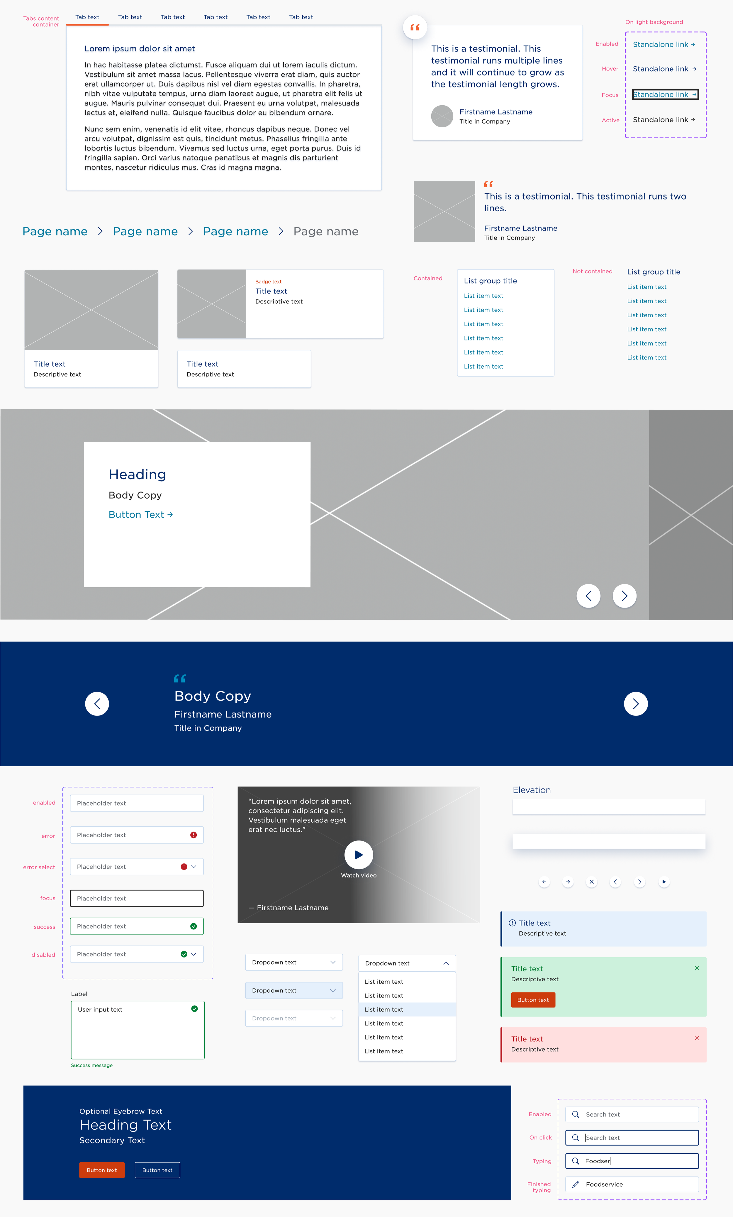
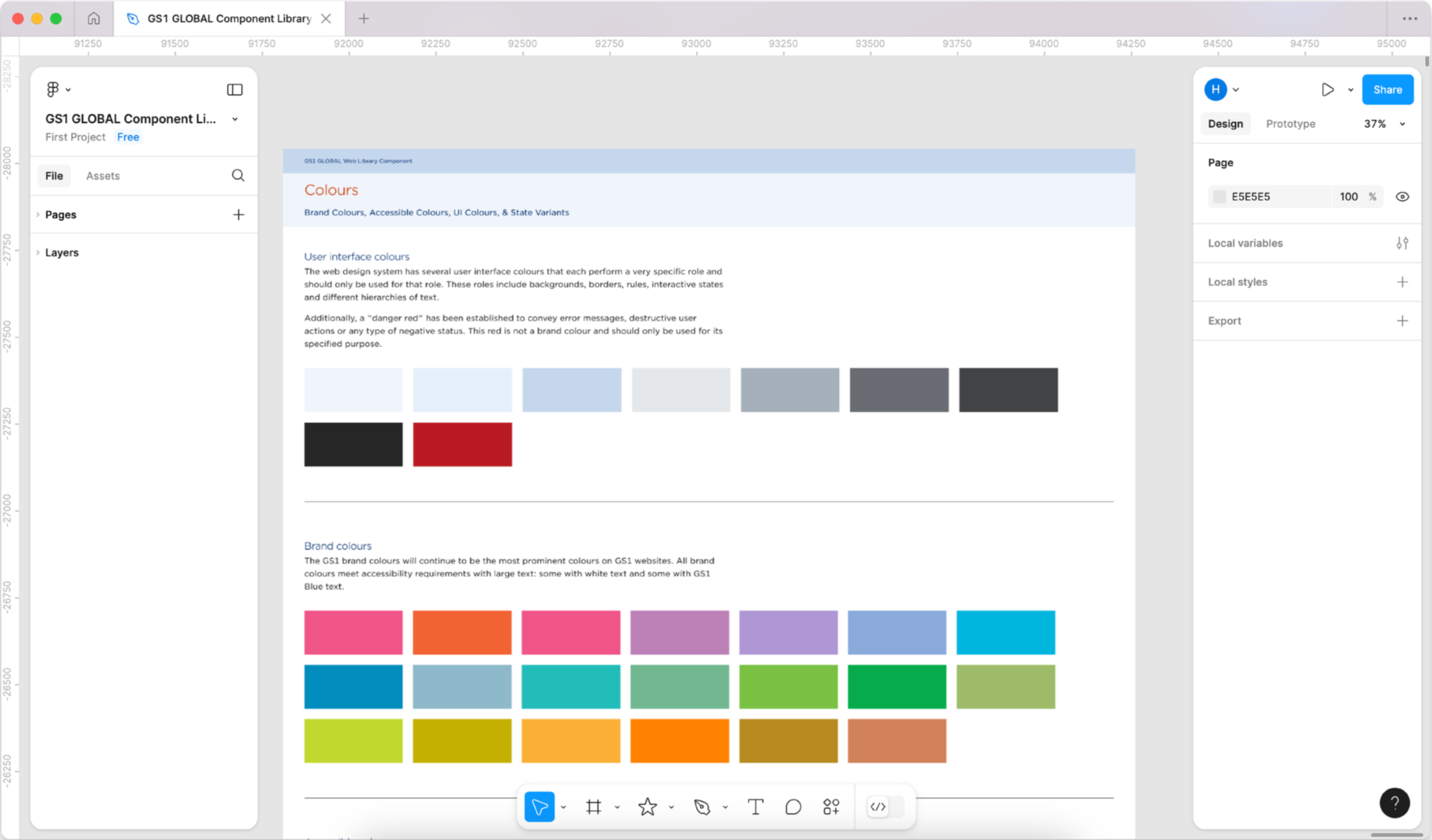
Collaborating closely with developers and stakeholders, we built a scalable library of over 1,000 components which enabled us to produce web pages faster and improve consistency across the website. This system significantly improved our workflow, allowing us to accelerate project delivery and dedicate more time to information architecture, visual design, and interaction design.


Project Goal
We began by aligning with our client and development teams to define a clear plan for building the large-scale component library. While we had the advantage of referencing GS1’s US member organization’s existing components, the process still required significant effort to plan, build, test, and refine a cohesive system.
To stay focused, we structured the project as a sprint, creating a centralized Figma workspace with a defined schedule and assigning each designer a set of components to own. Over the course of a month, we designed and built the components, learned from tutorials as needed, and collaborated to troubleshoot challenges along the way.
As components were completed, senior UX designers conducted reviews and testing, providing feedback on any inconsistencies or issues. Regular collaboration sessions allowed us to resolve complex components more efficiently and ensure the library remained consistent, functional, and aligned with our overall design standards.
Process
Working within a one-month sprint, we had limited flexibility to fully refine components or address more complex challenges. Many team members encountered unfamiliar component patterns, and budget constraints restricted the time available for deeper problem-solving. While collaboration with a senior UX designer helped resolve issues more efficiently, it also slowed our overall pace and added pressure to the schedule. To stay on track, we brought in an additional senior UX designer to provide review and support, ensuring we met our deadline without compromising the quality of the library.
Reflections
Once the components were complete, we shared the library with the client for review alongside their development team to ensure alignment and approval. The result was a comprehensive Figma component library containing over 1,000 fully functional, interactive components.
This library significantly accelerated our design process for web pages and applications, enabling greater efficiency and consistency across projects. With foundational components in place, the team can now focus more time on visual design and interaction details, while also taking on a larger volume of projects without compromising tight deadlines. Overall, the component library increased our project delivery by 30%.